Women & Children First:
Helping a local, feminist bookstore modernize their ecommerce experience.
My Role: Solo UX Designer & Researcher
Timeline: 2 weeks
Format: Responsive Website
Year: 2023
Background:
Women & Children First is an indie bookstore located in the Andersonville neighborhood of Chicago. I chose this business for an ecommerce redesign project because I was drawn to their mission statement, but their online experience had a lot of potential for improvement.
Discovering Opportunities
I began by conducting 5 user interviews with people who shop at W&CF, or had an interest in shopping there. My goal was to uncover the underlying needs of their customers, and either confirm or disprove my own assumptions about what users want.
While affinity mapping, several major themes emerged. So I asked myself, “What do I have the power to change? What will have the biggest impact for the smallest cost?”
I suspected that the best way to discover how customers experience the site was to observe them as they navigate it. So I conducted 8 contextual inquiries to help me decide where to target my efforts.
During this discovery phase, I also conducted market research to see what competitors were doing to overcome the challenges highlighted in the journey map.
In considering the user research and market research…
I watched users browse for a book, add it to their cart, and proceed as far as they could through checkout.
Then, I synthesized the findings into a journey map to visualize their shopping experiences:
I analyzed ecommerce sites for 2 industry leaders: Amazon and Barnes & Noble.
I also looked at another indie, local bookstore in Chicago: The Book Cellar.
3 pain points were revealed as opportunities for improvement:
Viewing a recommended book
The cart location
The wall of tasks at checkout
Understanding pain points
Pain Point 1: Viewing a recommended book
Initially, I assumed most people would begin their search using genre filters, or by typing something in the search bar. But…
75% of users began their search by navigating to “Staff Favorites,” or “Recommendations” sections on the homepage.
This finding was also backed by the affinity map, since a majority of interviewees stated that they wanted to see book recommendations.
But, unfortunately this starting point often led to confusion…
When customers clicked a book displayed in the Staff Favorites carousel, they expected to be taken to the book’s description.
But instead, the site navigated to the full list of Staff Favorites, requiring the user to scroll through the full list to find the book they wanted.
Every user that began their search this way complained-
“Why am I here? I clicked on the book, so why didn’t it take me to the book’s description?”
In fact, further inspection revealed that W&CF’s home page had no direct links to products, which users perceived as a barrier.
During market research, it became apparent why users had this expectation:
All of the competitors’ landing pages contained direct links to products, which meant W&CF required up to 50% more clicks to view a product.
Pain Point 2: Cart Location
Towards the end of the user journey, another pain point became clear.
87.5% of users looked for the cart in the upper-right hand corner, and expressed confusion when it wasn’t there-
“I added the book to my cart… but wait, I don’t even know where my cart is….”
Furthermore, W&CF’s cart was not available from the home page. Once viewing a product, the cart became visible on the left side of the screen, below the global navigation bar.
During market research, I confirmed my suspicion of why users were confused about the cart location:
All 3 competitors situated their cart in the upper-right corner, within the global navigation bar.
With this confirmation, I made a note to address this issue in my redesign.
Paint Point 3: Wall of Tasks at Checkout
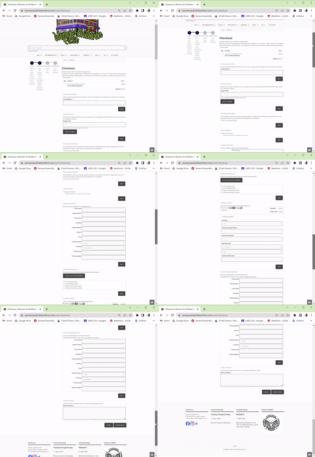
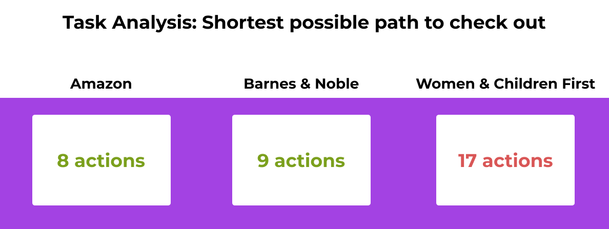
W&CF had about 2x the amount of checkout tasks, even without any browsing!
I already knew they don’t have direct product links on their homepage, but a large majority of these tasks were during the checkout process.
With a greater understanding of these pain points, at this point I felt ready to start sketching & ideating some solutions.
Once they found the cart, those same users were stunned by the long list of tasks they had to complete on the checkout screen-
“This is WAY too many steps to go through just to buy a book. Not very convenient!”
Some interviewees commented on the specific tasks- questioning their relevancy for making a purchase, or even pointing out redundancies.
So from here I decided to conduct a Task Analysis to evaluate W&CF’s checkout flow, and compare to the two industry leaders, Amazon and Barnes and Noble.
I did the analysis for the shortest possible path to purchase a book on each site. No browsing, no searching- just picking a book on the home page and buying it.
Here are the findings:
Sketching, Testing, & Iterating
I conducted 5 usability tests with new users to ensure they were still able to intuitively navigate the new layout.
I was eager to see how my targeted changes affected how users navigated the new layout, and I was pleased with the results:
Pain point 1: Viewing a recommended book:
100%
Everyone who started by clicking a recommended book navigated the flow easily, without confusion.
Pain point 3: Wall of tasks at checkout
Additionally, the checkout tasks were cut down by 52% with the new flow.
None of the users commented on it being too long, which seemed like a successful improvement!
While most of the people were able to complete the checkout process with ease, I learned 2 things I could change with the prototype to make it easier to navigate:
Pain point 2: The cart location:
100%
All of the participants found the cart immediately, without questioning its new location in the top-right corner.
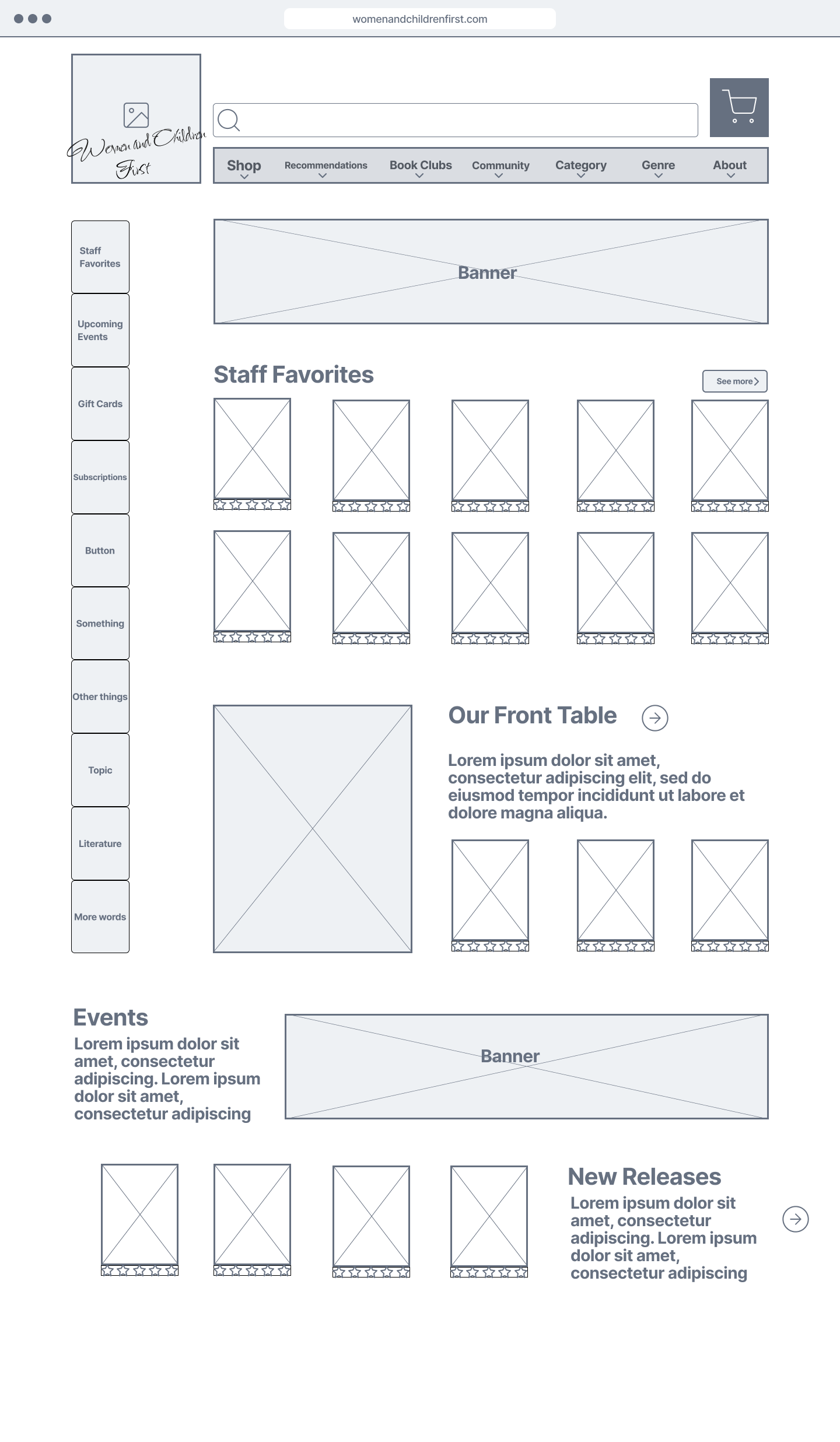
I sketched out low-fidelity wireframes of a new landing page, making sure the cart is situated in the top-right, as part of the global navigation.
I also made sure to feature links for purchasable items on the home screen, while preserving curated lists like “Staff Favorites,” featured on the home page.
Books Page
A few users wanted to explore the “Books” menu option when browsing. This would obviously be built into the final product, but due to time constraints I reserved it for next steps to focus on the 3 primary pain points discussed above.
I continued sketching wireframes through the checkout process, from clicking a book, viewing the description, viewing the cart, and checking out.
From there I developed this checkout flow into a mid-fidelity prototype, and then asked for feedback during some usability tests.
Breadcrumbs
Some users wanted to use the breadcrumbs in the checkout screen to go backwards. I hadn’t made them clickable for the first prototype, so I added those links into the prototype as well.
Prototype
Prototype
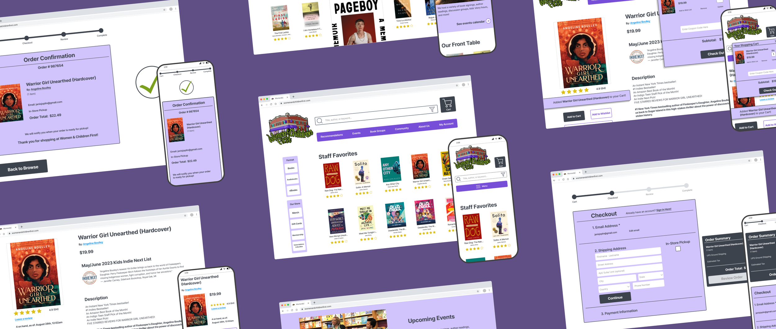
To check out the high-fidelity prototype, click the image to the right!
The task is: find the book titled “Warrior Girl Unearthed,” add it to your cart, and proceed through checkout until the order is confirmed.
Next steps
Given more time, these are the next steps I would have taken:
Local navigation
Some users said that the “Recommended” drop-down category was ridiculously long. I conducted some card sorting, but unfortunately it was rather inconclusive, so more research is needed to figure out the best way to reorganize that menu.
More user research
During the Feature Inventory, questions came up about a potential secondary persona who might require tax-exempt purchasing, as that was a required field during the checkout screen. It seemed to hint at a customer base working in education, but more research would be needed to confirm.
Events page
Contextual inquiries also revealed pain points in studies where users were tasked to register for an event. They encountered navigational issues that need further evaluation.
eBook opportunity
Several users expressed an interest in eBooks: I suspected this could an opportunity to develop a tablet version of the site that pushes eBooks to the front, as eBooks are most commonly read on tablets.
That concludes this case study! Thank you.
To find out more, contact me for an interview!


